Thoughts On The New Lubbock Branding Initiative
Well, at least they're making an effort.
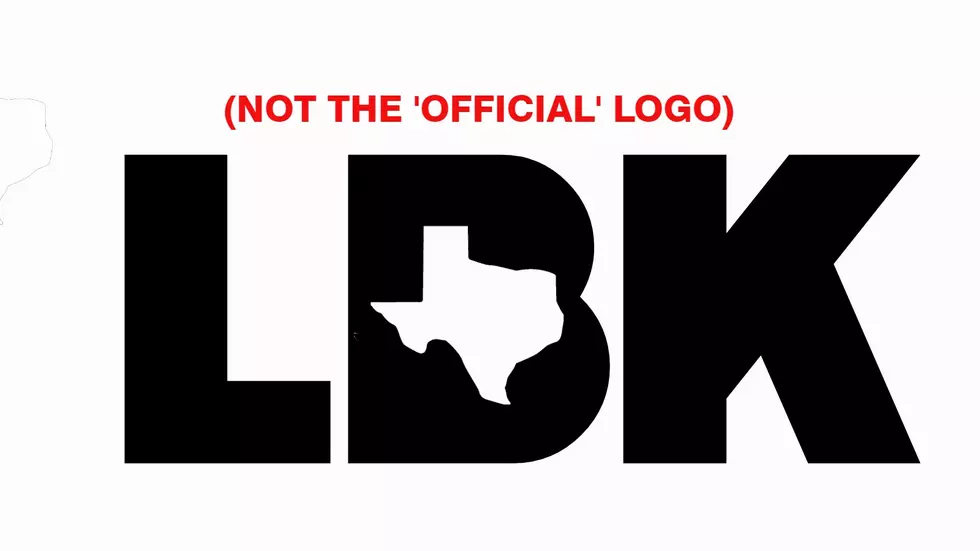
If you have not seen the new Lubbock community-wide branding initiative, it's basically "LBK" with the state of Texas cut out of the "B". So what does this say about our city? Let's go with "Lubbock Is In Texas". I'm not really sure what else I'm supposed to derive from this image.
You would think our logo might have some kind of nod to cotton/ag, windmills, or even Texas Tech (but that would bring up licensing issues). Instead, we basically get an airplane tag.
It's also easy for us to understand what it stands for, but is someone in Idaho, or Italy really going to go, "ah, Lubbock!"? I'm afraid that we're suffering from the curse of knowledge here and assuming that a lot of people know what "LBK" stands for and that they will also be able to mentally process that the middle letter is a "B" since it's been distorted with the Texas cutout.
Lastly, there's the corporate nature of this push. In order to use this logo you have to sign a branding agreement. You are supposed to follow certain "brand guidelines". Then there's the part the rubs me the wrong way most of all, you are supposed to do all this, and for what? The city wants you to use your advertising as their advertising. I just can't think of a product that would increase sales because it added this secondary logo on it.
I could see this logo being put on cocktail napkins when Lubbock is represented at a convention or something, but other than that, it's a pretty weak brand and a pretty weak effort.
(Note. I did not want to commit to their "Branding Agreement" so I recreated the logo, but this is basically what it is).
(Note #2. This is a community-wide branding initiative (spear-headed by the Chamber, LEDA, and Market Lubbock. It is not the City Of Lubbock proper and the article has been updated to reflect that).
4 Great Discount Stores For Lubbock Christmas Shoppers On A Budget
9 Things Santa Should Bring Lubbock For Christmas
Gallery Credit: Nessmania
More From 1025 KISS FM


