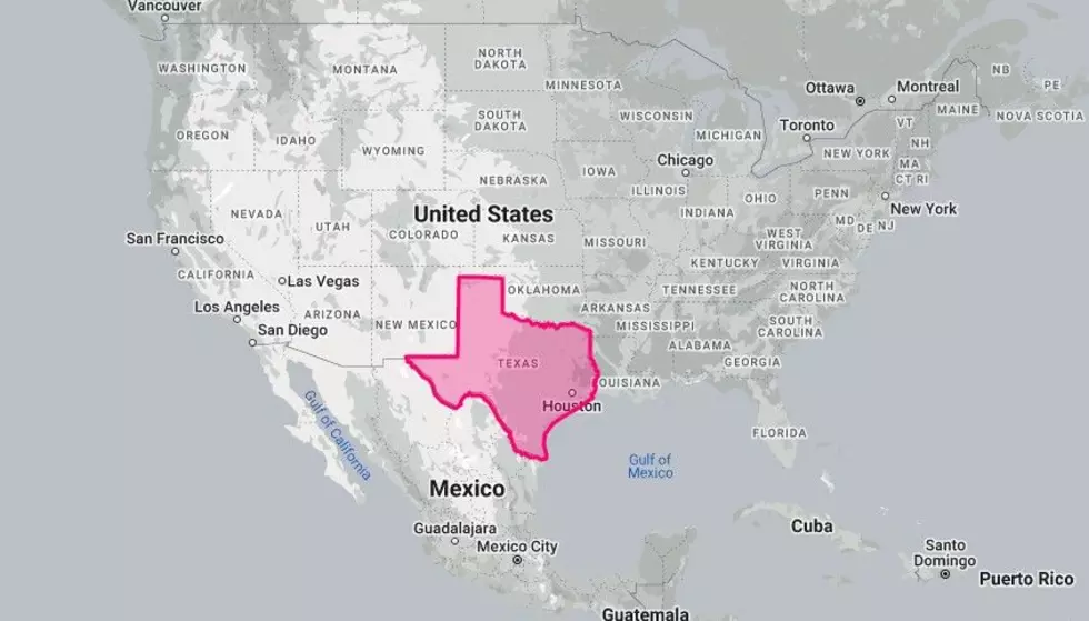
What Would Texas Look Like If We Took It Around the World?
When looking at a flat map of Earth, something many people don’t take into consideration is how disproportionate many of the countries end up.

The maps we go off of are designed from a spherical map being made flat, leading to distortion and wonky proportions. This means that the size of the countries you are viewing on a map often don’t equate to the size they actually are on Earth. Especially the closer they are to the north and south poles.
So, when you see how big places like Greenland and Canada look compared to the United States, the actual size difference isn’t that severe.
Knowing that, I was curious how the size of Texas would compare around the world. Let’s take a look at how the size of Texas changes as it moves around the map via the website thetruesize.com.
What Would Texas Look Like If We Took It Around the World?
Top Ten Laundry Hacks That Will Have You Tumbling With Joy
Gallery Credit: Heidi Kaye


